Imagine a scenario: a hotel developer invests $30 million into a new boutique property, only to see lukewarm guest reviews and lower-than-projected Average Daily Rates (ADR) six months post-opening. The rooms are technically sound, the service is adequate, but guests consistently describe the ambiance as ‘lacking character’ or ‘not quite living up to expectations.’ The culprit? A misjudged selection of services-trends/” target=”_blank”>Luxury Hotel Color Palettes that failed to align with the brand’s intended identity and target guest experience. This isn’t just an aesthetic oversight; it’s a costly misstep, potentially leading to a 5-10% deficit in occupancy or ADR, translating to hundreds of thousands, if not millions, in lost revenue over the first few years. For procurement managers, interior designers, and contractors, understanding the profound impact of color on perceived value and guest satisfaction is not merely a design preference—it’s a critical financial decision.

The Real Cost of Getting Luxury Hotel Color Palettes Wrong
The choice of Luxury Hotel Color Palettes extends far beyond surface appeal; it fundamentally shapes guest perception, operational costs, and ultimately, your project’s Return on Investment (ROI). A poorly conceived palette can lead to significant financial repercussions. For instance, selecting colors that clash with the brand’s identity or target demographic can necessitate costly re-procurement and renovation cycles within 3-5 years, rather than the intended 7-10 years. This premature refresh can add 15-20% to your FF&E budget, easily translating to an extra $500,000 to $1 million for a 150-room hotel.
Learn more about our projects.
Learn more about custom hotel furniture services.
Beyond direct costs, there’s the intangible but impactful effect on guest experience. In hospitality, first impressions are paramount. Colors that feel dated, jarring, or simply uninviting can lead to lower guest satisfaction scores, fewer repeat bookings, and negative online reviews. This erosion of reputation directly impacts ADR and occupancy rates, potentially diminishing profit margins by 3-7% annually. Furthermore, a lack of coherence in your color scheme can dilute your brand’s message, making it harder to command premium pricing. Thoughtful application of Color Psychology in Hospitality is crucial here, influencing mood, perceived cleanliness, and overall comfort, directly impacting a guest’s willingness to spend and return.
The Decision Framework — What to Evaluate Before You Choose
Before committing to any Luxury Hotel Color Palettes, a structured evaluation process is essential. This framework ensures your choices are strategic, durable, and aligned with your project’s overarching goals.
1. Brand Identity and Positioning Alignment
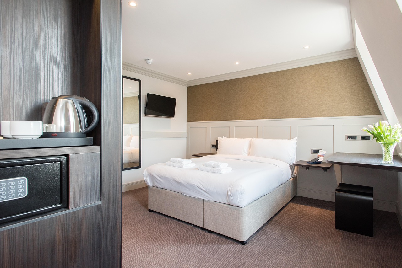
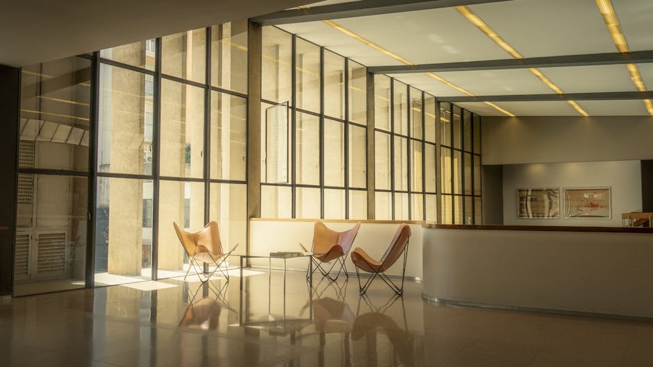
Your chosen palette must be an extension of your hotel’s brand story and market position. Is your property a vibrant urban hub, a serene wellness retreat, or a classic heritage establishment? A contemporary boutique hotel might lean into bold, contrasting hues or a sophisticated Monochromatic Luxury Design, while a resort focused on tranquility might favor muted, natural tones. Misalignment here is a core reason for guest dissatisfaction; the visual experience must confirm, not contradict, the brand promise. Evaluate how each color choice supports the narrative you want to convey.
2. Target Guest Demographics and Expectations
Different guest segments respond to color in varied ways. Business travelers often prefer calming, composed environments that support focus and relaxation after a long day. Leisure guests might seek more vibrant or unique schemes that evoke a sense of escape or local culture. For family-focused properties, durable, forgiving colors might be prioritized, alongside playful accents. Understanding your primary guest profile allows you to select Luxury Hotel Color Palettes that resonate emotionally and functionally, enhancing their stay and encouraging loyalty.
3. Location, Local Context, and Natural Light
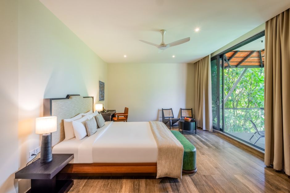
The geographical location and architectural context of your hotel profoundly influence color suitability. A coastal property naturally benefits from blues, greens, and sandy neutrals, connecting the interior with its surroundings. An urban hotel might leverage darker, more dramatic tones or metallic accents to create a sophisticated, metropolitan feel. Crucially, assess the natural light entering each space throughout the day. North-facing rooms, for example, receive cooler light and may benefit from warmer color temperatures to avoid feeling stark, while sun-drenched, south-facing rooms can handle cooler tones without appearing dim. Incorporating Biophilic Color Schemes works exceptionally well in natural settings, creating a seamless indoor-outdoor experience.
4. Longevity and Maintenance Considerations
Trends come and go, but luxury demands timelessness. Opting for overly trendy or niche Luxury Hotel Color Palettes can lead to rapid dating, forcing expensive renovations within a shorter timeframe. Prioritize foundational palettes (e.g., sophisticated neutrals, earthy tones) that offer enduring appeal, then introduce flexibility through easily changeable High-End Interior Accents like textiles, artwork, or decorative furniture pieces. Furthermore, consider the practicalities of maintenance: lighter colors show dirt more readily, while certain deep or highly saturated hues can fade unevenly over time, particularly in high-traffic areas or sun-exposed zones. Balancing aesthetic impact with long-term durability and ease of upkeep is paramount for cost-effective operations.
Comparison of Luxury Hotel Color Palette Approaches (2026)
| Palette Type | Key Characteristics | Brand Fit & Guest Perception | Maintenance & Longevity | Typical Application |
|---|---|---|---|---|
| Timeless Neutrals | Creams, beiges, soft greys, taupes. Creates calm, spaciousness. | Versatile; supports understated luxury, professionalism. Appeals to broad demographics. | Generally forgiving, excellent longevity. Accents provide flexibility. | Business hotels, classic luxury, urban retreats. |
| Earthy & Biophilic | Sage green, terracotta, warm browns, muted ochres. Connects to nature. | Eco-conscious luxury, wellness resorts, boutique hotels. Evokes comfort, authenticity. | Good longevity, often paired with natural materials. Less prone to showing wear. | Resorts, spas, properties with strong local connection. |
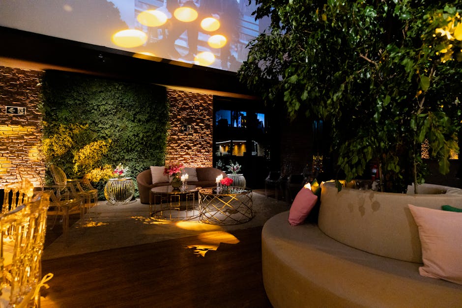
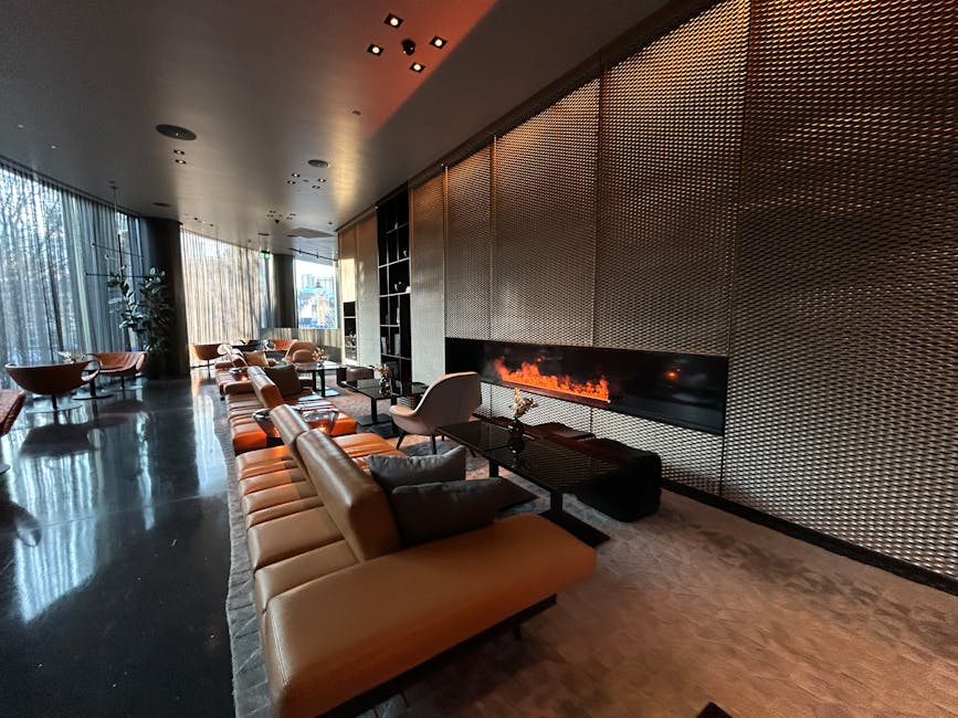
| Deep Jewel Tones | Emerald, sapphire, amethyst, ruby, deep navy. Rich, dramatic accents. | High-end urban hotels, upscale dining, exclusive lounges. Signals opulence, sophistication. | Requires careful application (accents vs. primary). Can be prone to fading if not high quality. | Feature walls, upholstery, decorative elements. |
| Monochromatic Luxury | Variations of a single hue (e.g., grey, blue, beige) with diverse textures. | Modern luxury, minimalist design, boutique properties. Creates harmony, sophistication. | Excellent longevity, timeless appeal. Texture variations prevent monotony. | Contemporary suites, design-led hotels, minimalist spaces. |
What Separates a Good Supplier from a Great One
Sourcing custom furniture requires more than just a price quote. A truly great supplier acts as a partner, providing expertise that goes beyond manufacturing. When selecting a partner for your Luxury Hotel Color Palettes and custom furniture, ask these critical questions:
- Do they offer in-house design consultation? A supplier with a professional design team can translate your vision into tangible specifications, advising on color integration, material pairings, and finishes that enhance your chosen palette. This holistic approach ensures cohesive results.
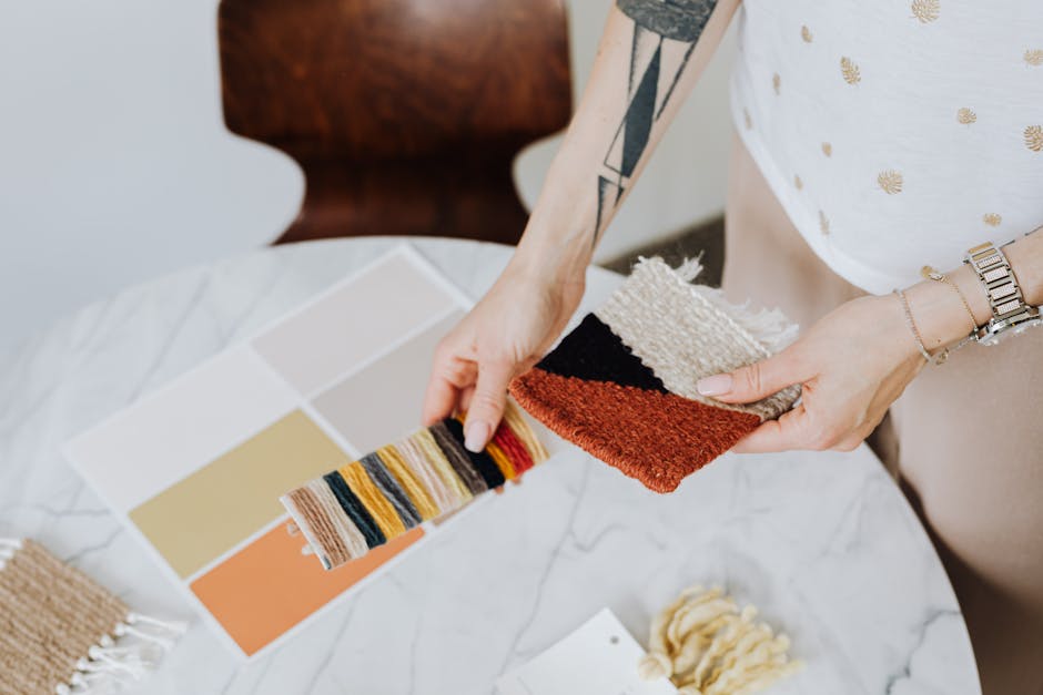
- Can they provide material and finish samples tailored to your palette? Seeing and feeling material swatches and color chips in your specific lighting conditions is non-negotiable. A great supplier will offer comprehensive sampling, sometimes even producing small-scale mock-ups, to confirm the visual and tactile qualities of your chosen Luxury Hotel Color Palettes.
- What is their experience with your specific hotel segment and aesthetic? Request a portfolio of projects that align with your desired luxury level and style. A supplier specializing in 5-star hotels understands the nuances of material durability, finish precision, and the refined aesthetic required for high-end environments.
- How do they ensure color consistency across different materials and production runs? Achieving consistent color across various materials (wood, fabric, metal, stone) and across multiple batches is a complex challenge. Inquire about their quality control protocols, dye lot management, and finishing processes that guarantee uniformity.
- Do they offer a one-stop solution from design to installation? A supplier capable of managing the entire process—from early-stage planning and design to manufacturing, logistics, and installation—streamlines your project. This reduces coordination headaches and ensures accountability, making Zhobai Hotel Furniture a preferred partner for complex hospitality projects. Learn more about our services.
Red Flags and Non-Negotiables — When to Walk Away
In the high-stakes world of hospitality procurement, identifying warning signs early can save millions and prevent catastrophic project delays. Here are specific red flags that indicate a supplier may not be the right fit for your Luxury Hotel Color Palettes project:
- Lack of Transparency in Material Sourcing: If a supplier is vague about the origin, specifications, or certifications (e.g., fire ratings, environmental standards like FSC for wood) of their materials, it’s a major red flag. This can lead to compliance issues, durability problems, and ultimately, a compromised aesthetic for your Luxury Hotel Color Palettes.
- Unwillingness to Provide Detailed Shop Drawings and Renderings: Before production, you need precise shop drawings, 3D renderings, and material specifications for every custom piece. A supplier that pushes to proceed without this level of detail is either inexperienced or trying to cut corners, which can result in costly manufacturing errors and design deviations.
- Inconsistent Communication and Unrealistic Timelines: Poor communication, delayed responses, or promises of impossibly fast turnarounds (e.g., full custom furniture production and delivery for 200 rooms in less than 8 weeks) are clear indicators of potential issues. High-quality custom furniture manufacturing for Luxury Hotel Color Palettes requires meticulous planning and realistic lead times, typically 12-16 weeks for production alone.
- No Clear Quality Control (QC) Process: Ask for details on their QC checkpoints—from raw material inspection to in-process checks and final pre-shipment inspection. A reputable manufacturer will have a documented, multi-stage QC process. Absence of this indicates a high risk of receiving substandard products that do not match your approved Luxury Hotel Color Palettes.
- Refusal to Offer Performance Guarantees or Comprehensive Warranty: High-value furniture purchases demand assurances. If a supplier balks at providing clear warranty terms (e.g., 2-5 years structural warranty) or performance guarantees for their finishes and materials, consider it a non-negotiable reason to seek alternatives.
How Top Hotels Approach Luxury Hotel Color Palettes Differently
Leading hospitality brands approach Luxury Hotel Color Palettes with strategic foresight, viewing them as integral to their guest experience and brand equity. They don’t just pick colors; they craft environments.
Consider ‘The Azure Haven,’ a new-build resort in Southeast Asia. Instead of a generic tropical theme, they collaborated with their furniture manufacturer’s in-house design team to develop a sophisticated Biophilic Color Schemes. This involved a palette of muted greens, deep teals, and sand-toned neutrals, using natural wood grains and woven textures. The result was a serene, immersive environment that felt deeply connected to its lush surroundings, leading to 90%+ guest satisfaction scores related to ambiance and relaxation. This intentional choice allowed them to command an ADR 15% higher than local competitors.
Conversely, ‘The Metropolitan Loft,’ a renovated 5-star urban hotel, opted for a bold yet refined approach. Their Luxury Hotel Color Palettes centered on a Monochromatic Luxury Design using various shades of charcoal and slate, punctuated by striking High-End Interior Accents in brushed brass and deep garnet. This created an atmosphere of sophisticated drama, appealing to a discerning business and luxury leisure clientele who valued contemporary design. The emphasis on texture—velvet upholstery, polished stone, and dark wood veneers—ensured the single-hue scheme felt rich and dynamic, not flat. This strategic choice positioned them as a design-forward destination, driving bookings from a specific, high-spending demographic.
These examples highlight that top hotels don’t follow trends blindly. They analyze their unique context, guest expectations, and brand vision, then execute their Luxury Hotel Color Palettes with precision and a long-term perspective. They leverage their supplier’s design capabilities to translate these complex visions into reality, ensuring every custom furniture piece contributes to the overall narrative.
Your Action Plan — Next Steps for Your Project
Making informed decisions about Luxury Hotel Color Palettes is a multi-stage process. Here’s a concise action plan to guide your next steps:
- Define Your Core Vision: Clearly articulate your hotel’s brand identity, target guest, and desired emotional experience. This forms the bedrock for your palette selection.
- Research and Refine Palette Concepts: Explore various Luxury Hotel Color Palettes that align with your vision. Gather inspiration, considering both aesthetic appeal and the psychological impact of colors.
- Consult with Design Experts: Engage with experienced interior designers or your furniture supplier’s in-house design team. They can provide invaluable input on material compatibility, light interaction, and long-term viability.
- Request Comprehensive Samples: Insist on seeing physical samples of all proposed materials and finishes under various lighting conditions. This is crucial for verifying the true appearance of your chosen Luxury Hotel Color Palettes.
- Vet Potential Suppliers Thoroughly: Use the checklist provided in this guide to evaluate suppliers on their design expertise, QC processes, and project management capabilities. Prioritize partners offering a full-service solution.
- Develop a Detailed Project Timeline and Budget: Ensure your timeline accounts for design, sampling, manufacturing, logistics, and installation. Allocate a realistic budget that reflects the quality and customization required for luxury hospitality.
Selecting the right Luxury Hotel Color Palettes is a foundational decision that impacts every aspect of your project, from guest perception to long-term profitability. At Zhobai Hotel Furniture, we understand these stakes. With over 15 years of experience specializing in custom furniture for 5-star hotels and resorts worldwide, our approach is built around consultative partnership. Our professional in-house design team collaborates closely with you, translating your vision into exquisite, functional furniture that perfectly embodies your chosen Luxury Hotel Color Palettes. From early-stage planning and design to manufacturing, logistics, and installation, we offer a one-stop solution designed to de-risk your procurement process and elevate your project. Start a conversation with us today to explore how our expertise can bring your vision to life.